

Text-Shadow Anti-Aliasing
Tuesday, January 26, 2010 05:25 AM
Like many people in our industry, I have been reading and learning about typography on the Web to find good ways to embed fonts using @font-face while nimbly dancing around the many complexities of different browsers and formats. It’s very exciting to see more and more sites using “non-standard” fonts. However, one of the issues we as web designers currently have to deal with is the differences in render in font hinting between browsers and operating systems. I’m really not a big fan of how Windows usually handles this, so I decided to try to do something about it.
Sandbox
I’ve set up a sandbox to experiment with text-shadow anti-aliasing. Please check it out! It would be great to hear your thoughts on the technique.
I’m one of those few self-conscious people at places like An Event Apart that you see using a PC. My ugly Dell is conspicuous amidst a sea of glowing Apples. Because of that I see the font rendering on Firefox Windows every day. The occasional times I see Mac’s Safari rendering pages I sigh a little. Now, I understand how Apple and Microsoft have decided their own paths of font hinting. Apple to allow their smoothing to deviate from the font’s true form; Microsoft to rigidly follow the font’s pixels and push them into the grid. I respect the typographer, but some fonts haven’t been optimized for the Web yet, and until they are and browser vendors do a better and more consistent job in their rendering, this is a problem to me. The Windows version looks rough.
A couple weeks ago while reading Kyle Weems’ CSSquirrel I noticed that he was using a CSS text-shadow rule on his body text. While I don’t think he was using @font-face to import a special font, the text-shadow was used as a soft glow. It got me to thinking and tinkering with a design I was working on that I wanted to use some different fonts on, but was struggling with the rendering. Especially on resolutions around 1280 x 1024, things look very choppy. By using a very soft shadow of the same color with no movement away from the text, I have been able to soften the characters by hand. A kind of hacked anti-aliasing. Then, to drive home my point I noticed Mark Pilgram using the same technique (I’m assuming intentionally) on the font Essays 1743 at Dive Into HTML 5. Without the shadows on Firefox Windows the type just looks kind of crappy, but with the shadow it is nice and soft.
I was excited to see an example of what I was working on in the wild. I have been frustrated with using fonts after seeing the rendering fail so much. With all respect to Jason Santa Maria, that’s the one unfortunate short-coming of his redesign of Bobulate when viewed in certain environments. The font he choose, Skolar, is perfect for the site. I don’t think another font would fit the content or feel better, but on my machine the text didn’t look great. This isn’t Jason’s fault by any means, nor is the site ruined by it, but I wanted a better way to do fonts until operating systems and browsers throw us a bone.
This is what I am proposing:
text-shadow: 0 0 1px rgba(0,0,0,0.3);
That’s the essence of it anyway. The RGB values need to match the color of your text. I’ve also found that headings generally do good with an alpha value of 0.3 or 0.4 (sometimes higher), while body text is too busy with 0.3 and 0.2 is more subtle. Let me show you a few screen shots:
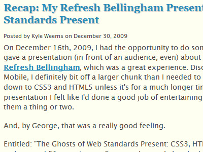
CSSquirrel on Firefox / Win without text-shadowing (currently as is)
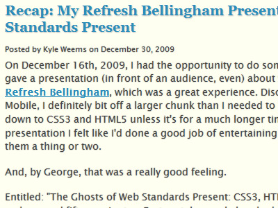
CSSquirrel on Firefox / Win with text-shadowing (how it was)
Kyle told me that some users the shadow was creating a fuzzy look.
Kyle’s font-stack calls for Lucida Grande followed by other more common sans-serif fonts. I think his decision to remove the shadow while he revisits his options is good. The fonts are doing fine on my monitor without the faux anti-aliasing, though the difference on the screenshots is apparent.
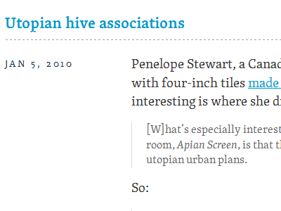
Bobulate on Firefox / Win

Bobulate on Firefox / Win with text-shadowing
Especially notice the S’s in the headline and the date text.
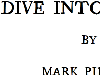
Dive Into HTML 5 on Firefox / Win without text-shadowing
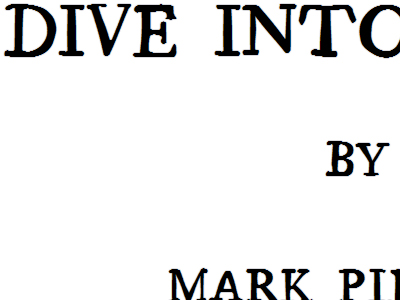
Dive Into HTML 5 on Firefox / Win with text-shadowing (as is)
The difference between having a text-shadow and not is subtle, but I think often it’s worth it.
So what about Macs? Well, there is a small difference, but not near as much as on Windows. Macs already smooth their fonts, so the shadow isn’t as noticeable. I asked a few friends and one thought the shadow made it easier to read, a couple others preferred the crispness of the un-shadowed (perhaps what Kyle’s readers were experiencing). However, I think the difference is negligible so as to make it worthwhile for Windows users. My friends who saw the above examples preferred CSSquirrel without shadowing (good call, Kyle) and with shadow for the other two.
However, different fonts and different color combinations require different settings. There isn’t a one size fits all. Because of that I have set up a test site for you to play around with various settings. While I have had some input from non-web designer friends, I would appreciate your feedback on this technique: do you think it is worthwhile? Would browser or platform sniffing make it better?
I am also working to develop a bookmarklet that will allow you to select an element and apply a text-shadow. Basically what Firebug can do, but with a simpler interface.
I hope you find this technique useful. I have already used it on some of my designs where appropriate.
Notes: Thanks to Kyle Weems for putting his site back to how it was temporarily so I could screen capture it and to Jason Santa Maria for giving me some initial feedback on this. Also, I saw an article today about making Safari / Win render fonts better. If you leave feedback, please specify your OS, browser, and screen resolution.

Comments
Marko Prlji? said
Very interesting. I’m gonna try to apply this from now on. It’s definitely worth it. Thanks for the test site.
On 01/26 at 11:47 PM
Richard Underwood said
As a Dell/Windows user myself I understand completely where you’re coming from. I experienced the same issues with choppy rendering of custom fonts on a project recently and applied the same method, with very satisfying results.
On 01/27 at 07:12 AM
Jon Adams said
Great article and nice work with the sandbox. I think the technique is very handy, and like you said, “there isn’t a one size fits all.”
I’ve only recently begun to take advantage of non-standard fonts for use on the web, and I’m very glad I took the time to test across browser and os for the very reasons you mentioned.
I tested well over twenty different fonts before choosing one that worked well for me the site and across operating systems. Many of my first picks rendered so poorly I just tossed them out. Would have been interesting to try this technique.
I’m not exactly a typography guru (so I can’t say with any kind of authority,) but in my testing, it would seem some fonts were just designed better to render similarly across operating systems.
On 01/27 at 07:29 AM
Mike said
This post really interests me because I’ve been doing a lot of work/research on @font-face/anti-aliasing issues.
I’ve experimented with text-shadow myself and have found it to be very hit and miss, as with the majority of work arounds. I’d like to suggest a couple of posts that may shed some more light on these issues, in particular the first post contains a lot of great information in the comments alone:
http://allcreatives.net/2009/12/05/smoother-font-face-embedding-in-ie-7-8/
http://allcreatives.net/2009/12/19/looking-at-the-bigger-picture-of-cleartype-and-font-face-embedding-firefox-and-safari/
On 01/27 at 02:31 PM
Marco said
That’s really useful. I started to use “Segoe UI” 12px as the main font and with alpha at 0.2 it’s looking better.
On 01/27 at 05:19 PM
Joe Clark said
If I understand this correctly, you are trying to compensate for single-pixel stems in onscreen fonts, a known irritant. People publish all sorts of hacks for E-books to turn on “bold font,” as they insist on calling it. It’s the same problem. What you’re simulating here is weight, not antialiasing.
Nonetheless, you shouldn’t have to do it.
On 01/27 at 09:14 PM
Philip said
Thanks for all the positive feed back everyone! I’m really excited that you find this useful and worth checking out. It’s good t know I wasn’t the only one thinking of this. Share it around if you think it will help!
@Marko and @Richard - I’d be interested to see how you’ve implemented this.
@Jon - That’s correct. Many fonts, most probably, have not been optimized for web viewing. That’s not surprising because even though it was possible through Microsoft’s EOT format years ago, it hasn’t been popular until 2009. Designers and foundries just haven’t focused on it. I’m sure we’ll see that change dramatically this year.
@Mike - I haven’t had a chance to do more than glance at those links, but it looks good and I’ll read them fully later, thanks for posting!
@Joe - Yes and no. It does change the weight some, but not to full bold. When playing with this, the biggest thing I’ve looked at is jagged curves (this is really displayed in the Dive Into HTML5 example). Rounded letters and numbers really suffer from this. And yes, I wish we didn’t need to do this.
Of course, another alternative is very cautious font selection and robust testing. Sometimes though, you really just want to use a font and the technology!
On 01/27 at 09:38 PM
cem said
Great article and nice work with the sandbox. I think the technique is very handy, and like you said, “there isn’t a one size fits all.”
I’ve only recently begun to take advantage of non-standard fonts for use on the web, and I’m very glad I took the time to test across browser and os for the very reasons you mentioned.
I tested well over twenty different fonts before choosing one that worked well for me the site and across operating systems. Many of my first picks rendered so poorly I just tossed them out. Would have been interesting to try this technique.
I’m not exactly a typography guru (so I can’t say with any kind of authority,) but in my testing, it would seem some fonts were just designed better to render similarly across operating systems.
On 12/07 at 09:17 AM