

HSI Case Study
I developed a modern responsive website for Health & Safety Institute and helped them prepare their content management system so their team could move forward successfully on their own.
“Phil was able to bring a lot of needed expertise to our website project that really brought it to the next level. While design may change over time, the backend code-structure and foundation he helped build will live on for years to come.”
“He’s not only an expert, but he’s also a pure joy to work with. Easy-going and organized he was always able to deliver on-time with excellent results.”
— Jason Williams, HSI
Meeting the Needs
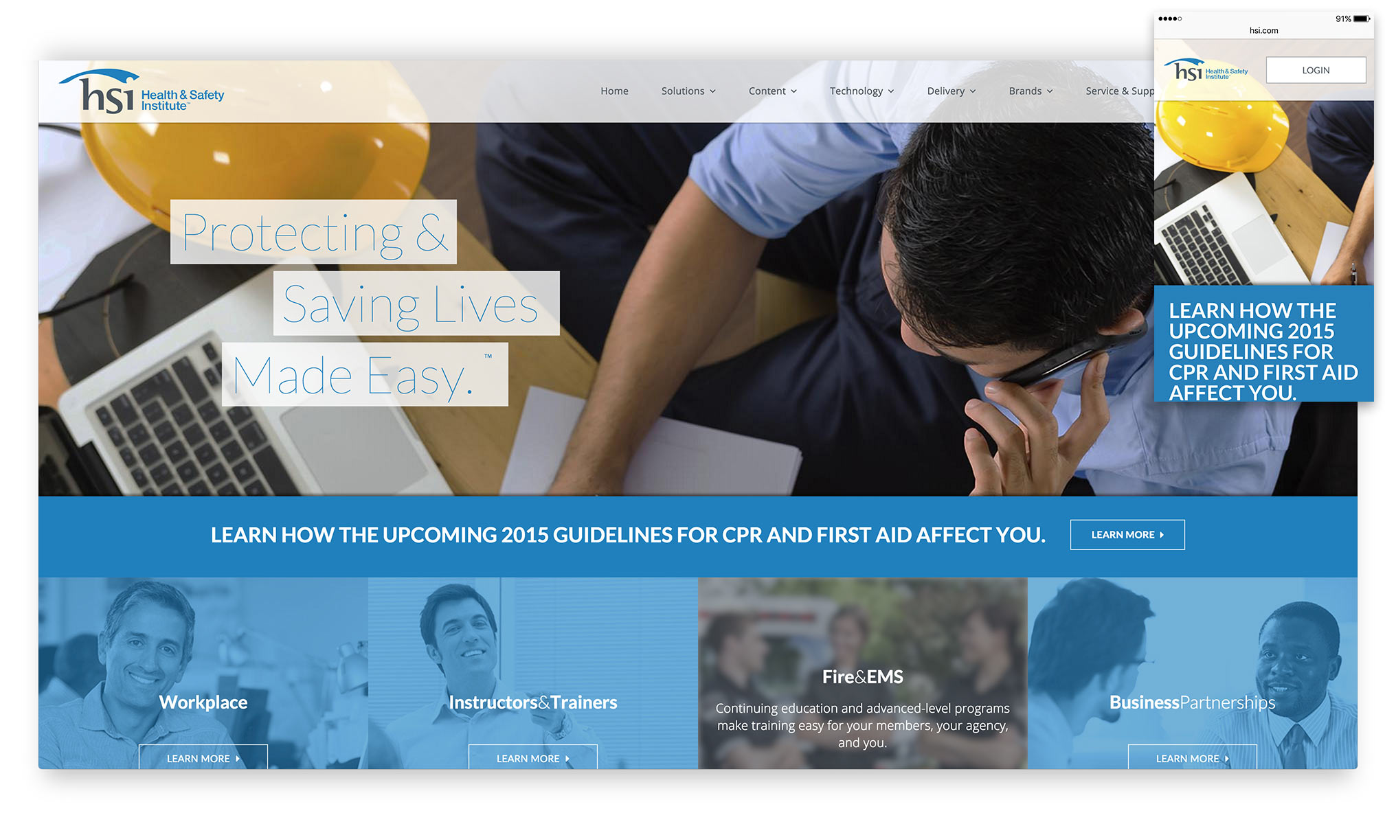
For the about three years, HSI had a website that was not sufficient to their needs, or the needs of their users and clients, as their site is often used on tablets and mobile devices. In their words “It was not generating leads the way it needed to and was losing traffic because it was not ‘mobile-friendly.’” They came to me knowing of my passion for creating sites that work across the wide device ecosystem and together we created a beautiful website that addresses the pain points their users had and will support them for years to come.
The Health & Safety Institute is a collection of emergency, health, and safety services and solutions. They provide training and support to companies across the United States and Canada in the crucially important areas of onsite safety, including fire and first responder training. As their tagline says, “Protecting and saving lives made easy.”
“As our business model was evolving our website needed to evolve to build a better sales-funnel for inbound web leads as well as serve as a resource for our existing customers.”
Joining the Team
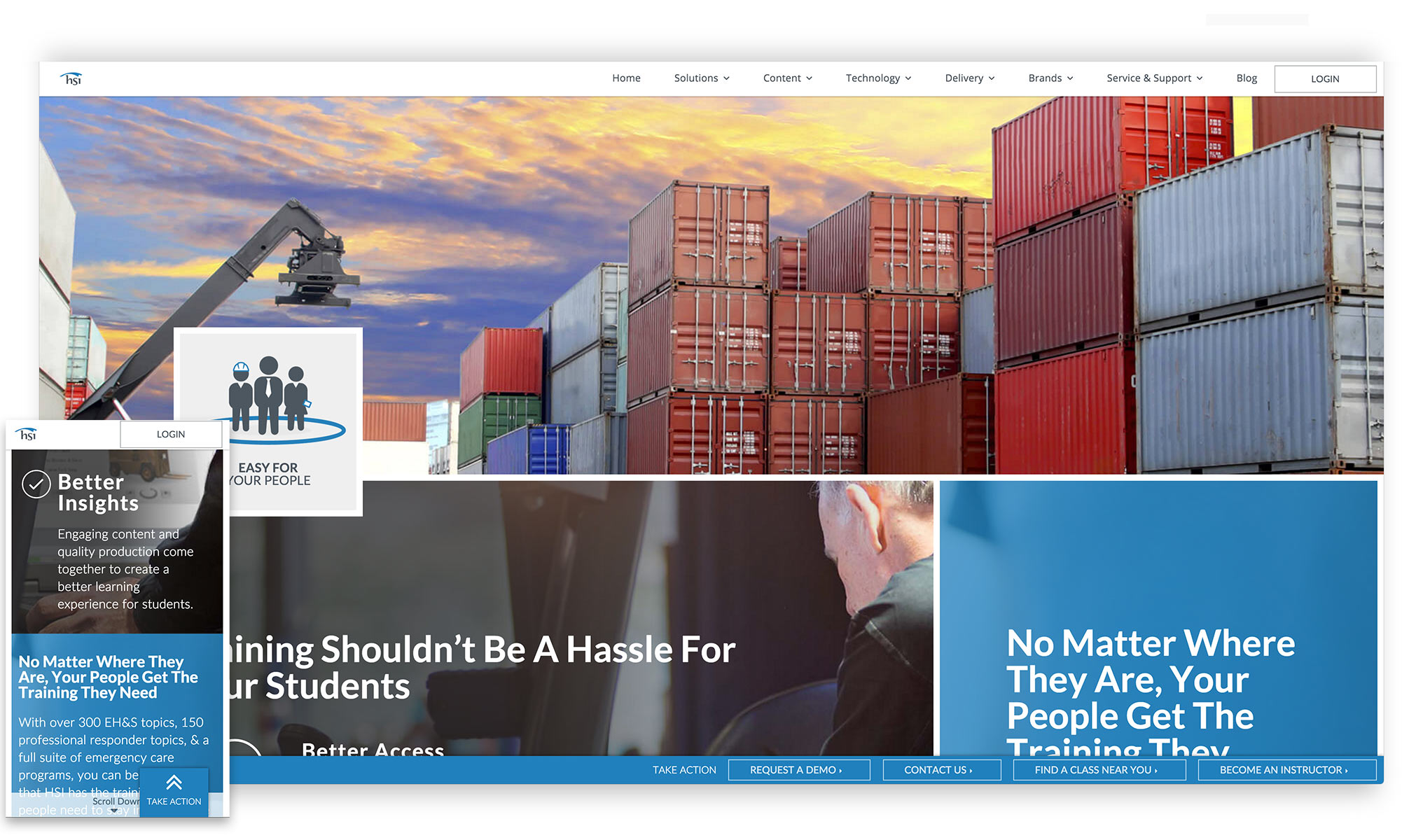
Prior to this latest website, the family of HSI brands were spread across several different websites that had various aesthetics and no cohesive voice. Their design team worked hard to bring all the brands together under one banner, from copy, to design, to URL structure.
My skillset fit in nicely with their needs. The web’s ubiquitousness and intent to be globally accessible has always fascinated me, and over the last several years I have focused on responsive web design, watching as the technology emerges and becomes adopted by browser vendors. Additionally, my work with Webtrends taught me a lot about user experience design and I was able to bring that to the table to help guide some of our decisions.
HSI has a small web and marketing team, and doesn’t have a need for a full time developer. I was brought in to be their front-end developer expert to get the new site running and then handed off. I built the templates and integrated them into their content management system (Hubspot, in this case). During this process I worked with their designer iteratively so we could smoothly handle all design variations needed for the site to succeed across any screen size. My experience working across devices allowed me to advise and support the design process, rather than just smash a “desktop” design into “mobile” making for a more seamless experience.
Mobile Friendly
One of the problems that needed to be solved with this new site is that many of their users access the sites while out on the job: in a warehouse, out on site, etc. Basically, not on traditional desktop computer with a fast internet connection and large monitor. To solve this, I came up with design and layout variations that were informed by usage data. Depending on the user’s screen size, the site lays itself out accordingly. The design team used this information to create multiple versions of their major imagery. With these the site can load appropriately sized images which helps the site load as fast as possible while users are on the go.
Throughout the project I put in place structures to help me and the HSI team succeed – not only during production, but after we launched and my part was finished. I setup version control for our work so nothing was lost, implemented a bug tracker to make sure we stayed on task and knew what had to be done, and used automation tools to speed up code development and deployment.
The result? I’ll let HSI say it again:
“The current site delivers on the promise to be much more flexible as we continue to evolve.” — HSI
Kathy Sommer Case Study
I built an easy to use custom theme with specialized audio components for a talented musician.
“Working with Philip on my website was a great experience in every way. His superior computer and communication skills, along with his precision and attention to detail have made what seemed like an overwhelming process, possible.
“Ever patient with endless questions from a novice, and willing at every turn to not only come up with creative solutions for each problem along the way, but to educate and enlighten as well. I can’t imagine having a better experience or being more thrilled with the final outcome.”
— Kathy Sommer
The Problem
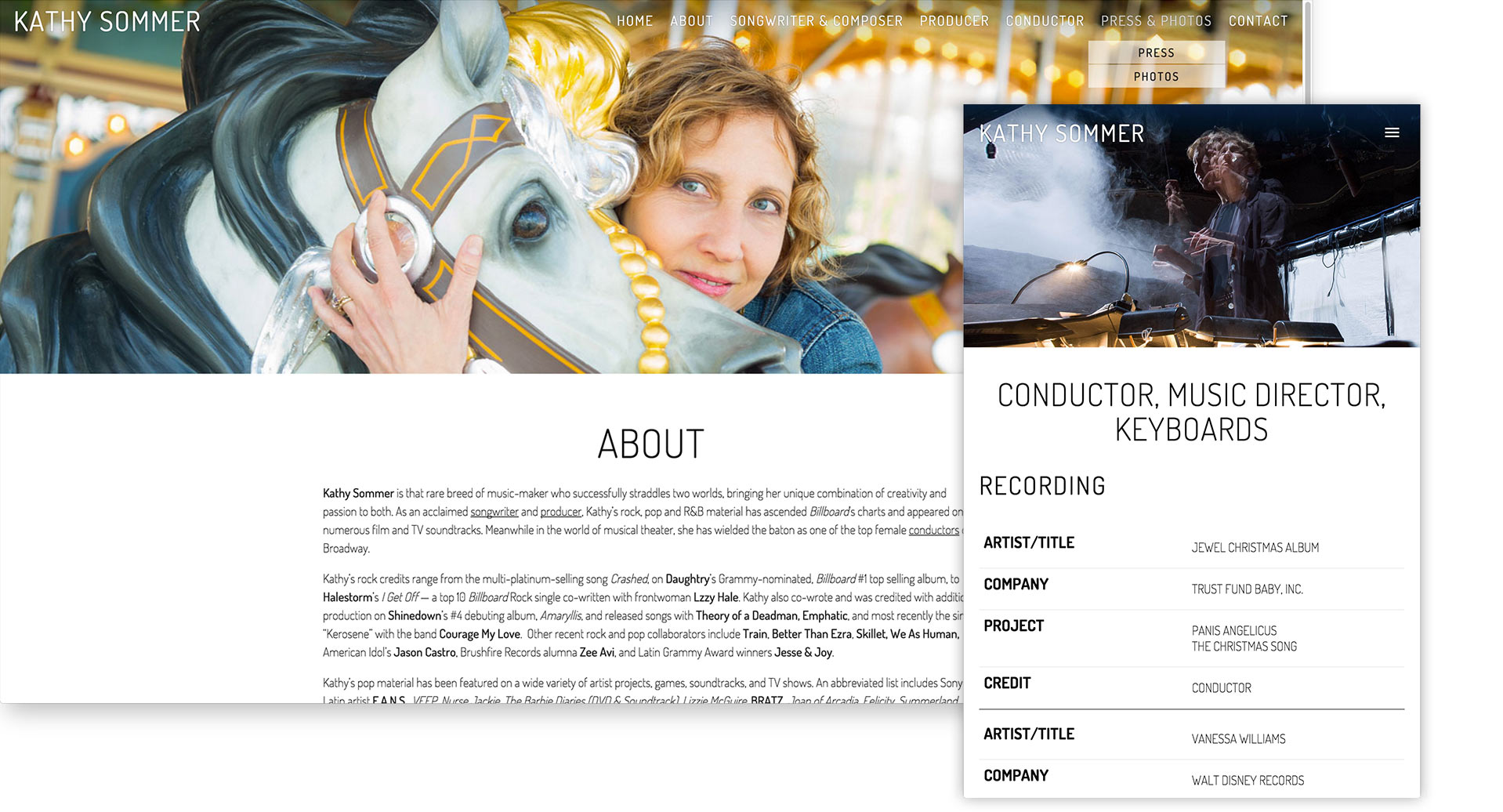
Kathy Sommer had a wonderful design for her website, but it called for customized audio players and a more complicated layout than her host Squarespace could handle out of the box. She brought me on board to build a custom theme with an audio player she could manage on her own after launch.
Squarespace has a system that is very easy to use for those who aren’t web professionals. It has expansive themes and simple content editing tools. However, its simplicity has its limitations. The design Kathy had commissioned would not work with any of the provided templates. Along with the overall layout design, the requirements for the content design were more than the basic Squarespace components could handle.
It was important to Kathy that we not compromise on the design and also that she be able to maintain the site independently, without needing to hire a professional for every minor update or new song inclusion.
The Solution: Customizing Squarespace’s Theme
Using Squarespace’s developer mode I created a custom theme that allowed me to fine-tune the markup and placement of content blocks to meet the needs of the design. This route also allowed me a better way to manage global assets like design images and stylesheets. It also kept complexity out of the front-end facing content management system.
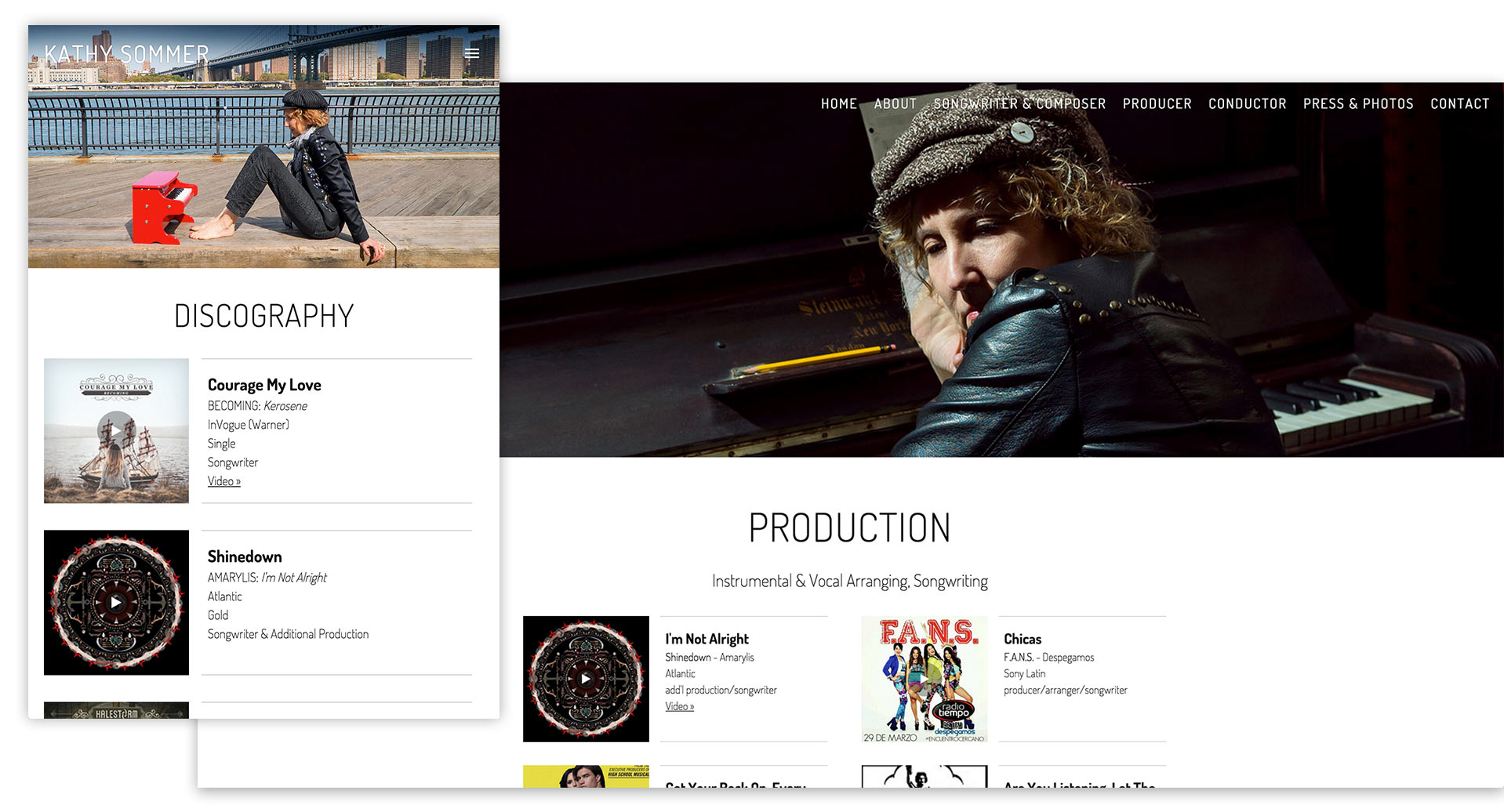
The audio player was custom code created to meet the needs of the design as neither of Squarespace’s audio blocks (their native one or the Soundcloud embed) would serve. Using Squarespace’s custom code block, I carefully crafted an audio player that would be simple and intuitive for Kathy to use herself. In tandem with Dropbox for file management (something that Squarespace lacks), she will easily be able to add new songs to the site without waiting for or paying someone else to do it for her.
Because some of the pages have a couple dozen audio tracks, we needed to be sure we weren’t blocking loading of images and other assets while the audio was downloaded. However, we also knew users would not want to wait for their chosen track to load after clicking play. As a solution the audio files don’t preload until the page has told us that everything else is displayed and ready. Once that is done, they are downloaded so they play immediately when the user requests, giving them the best experience. As an added bonus, iOS devices don’t preload the files at all until explicitly requested by the user, saving bandwidth on devices with a high chance of being on a limited network.
Training for the Future
Once all the code was written and the site was done, I spent some time with walking Kathy walking the site, teaching her to update it and clarifying the Squarespace system. My goal is to always leave a client with more than just a website they’ve approved, but a plan to move forward and the confidence to execute it.
Reflections
One of the nice things about going with Squarespace’s developer configuration is the templates are managed through Git. This meant I had versioned controlled backups during the entire process. If anything glitched, or I needed to go back to a previous look, I wasn’t hoping I’d made manual backups at the right point.
Coming onto a project after a lot of the research and design process has already been completed is never easy, but with a lot of communication and a very understanding designer, we were all able to make things work smoothly. Overall, I’m very happy with the outcome of this project - a smooth experience that solves Kathy’s specific needs and is accessible across mobile devices. And, more importantly, Kathy is also happy with the result.
Webtrends

I was hired as a user interface developer at Webtrends in part because of my knowledge of and excitement for responsive web design. With my skills in HTML, CSS, and JavaScript plus an underlying understanding of user experience learned through my client work, I was able to be a bridge between the UI and UX teams. Over the two-plus years I was with Webtrends, our teams shifted and grew to where a dedicated bridge wasn’t necessary and I moved deeper into JavaScript development.
The two main projects I helped develop are Webtrends Streams and Webtrends Explore.
Streams is a set of data visualizations built using WebSockets including a “lab” that allows the user to do basic data exploration and select which parameters to use in a pre-built visualization. Streams is designed to be usable primarily for large displays, but can also be manipulated on a range of other screen sizes. Since these visualizations are to help customers show off their data, I worked to make them accessible on tablets as well.
Explore is an ad-hoc data analysis tool that allows the user to segment and dig into data on the fly. We built it on Rails as a single page app with a custom JavaScript architecture/framework based on Backbone.js that we created specifically for our needs within Webtrends. This framework, which also included Require.js and Underscore.js, allowed us to spin up new product apps extremely fast and begin development.
As both of these examples are part of Webtrends’ suite of paid-for solutions, I can’t link to the actual products. However, the training videos explain and show their capabilities.
Streams:
http://youtu.be/_2AhTzYCfXQ
http://youtu.be/Baer61R00Uk
Explore:
http://youtu.be/nLDLTsxX8l8
http://youtu.be/m_HUOSCCE1Q
http://youtu.be/C8hI8H3PLP8
Streams also won the Digital Analytics Association New Tech award.
AJ Swoboda
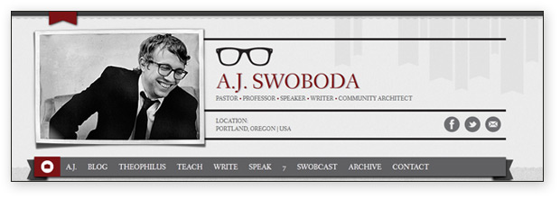
A.J. Swoboda, a friend of mine, and also a PhD, author, speaker, and pastor, asked me last year if I would create a website for him. I love A.J., getting coffee with this guy is always a huge treat, so I was excited he would trust me with this: you all know how work for friends can be! Fortunately, he knows that too and made sure there was no weird friend expectations or anything. I met with A.J. to discuss what he was looking for in the online presence. Among the conversations about content, needs, and functionality, he showed me this photo of Karl Barth, a Swiss theologian to convey the feeling he wanted to express through his website. It was perfect. I went to my friend Noah Cremisino with the photo and project details. With some minor input from me, Noah created this design which perfectly rendered what A.J. and I had in our heads.
This was my first full-on foray into responsive web design - making the site work fluidly across any device browser size. Because the layout is fluid (and so are some text elements and images), I only saw it necessary to create one break-point when you get to a really narrow screen resolution. This makes it play beautifully with phone and tablet sizes. I had a great time creating and coding this site! All of my work now incorporates media queries for responsive (responsible) web design.
School of Global Transformation
www.sgtinfo.com

Lately I’ve been working on a lot of custom WordPress installations. SGT is one of the several in the past few weeks I’ve done. I work with a couple designers to code and integrate the design into WordPress. In addition to doing a custom theme, this often requires modifying the install through Plugins or custom PHP code.
Blessed to Be a blessing
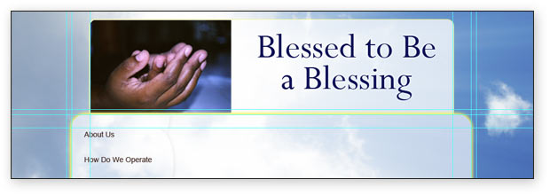
BTBAB needed a site they could easily maintain themselves, yet were willing to invest some time learning a system. Because of that, and because I was handling the entire creation of the site for them, including design, I decided to go with Expression Engine rather than writing a custom CMS. This helps speed the process up a bit while still giving me plenty of flexibility in the structure and backend. The majority of the design here is rendered using semi-transparent PNGs. This, of course, presented a small challenge in the form of Internet Explorer 6, but one that is surmountable. Using the PNGs allows the content area to work no matter where it is sitting on the background image, giving the user the flexibility to use whatever screen size or window size that suits them.
Philip Renich | Websites
www.elfboy.com
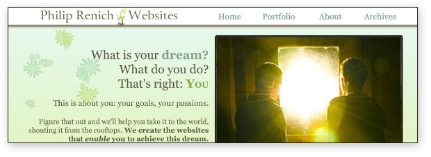
Well, when I first started redesigning this site I figured I would need something as a placeholder at least! But hey, it’s still my work and therefore will reside in my portfolio. Not to mention that at the moment, it is still a work in progress as I continue to learn Expression Engine. I also have some design touch-ups I would like to make. Finesse and subtlety.
This is the 3rd edition of elfboy.com (well, 4th if you count the short lived WordPress version of the 2nd design used). The color scheme is based off of a huge tree in my back garden. I am really pleased with the outcome of this site, especially since it went from conception to completion in about 2 weeks! I decided to go to WebStock, a web design conference in Wellington, New Zealand and knew I need to revamp this place. Next time I think I’ll try to give myself more breathing room!
Intel - Cool Software
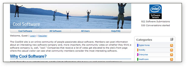
Cool Software is a site where users (especially including the general public) can submit software they find for other’s benefit. People can then say if they like it or not, moving it up and down the ranks of the site in a Digg-like fashion. The software at the base is an open source program called Pligg. However, Intel needed some custom features and a template to match their corporate brand. I provided them with both of these. Previous to this job I had only glanced under Pligg’s hood once, and that was for minor CSS and theme modifications only. Given the tight time frame, I was quite pleased how quick I learned the inner-workings of the software so I could write Intel’s custom plugins and other custom features.
Cool Software received around fifty-five thousand visitors in its first public week and now receives about one million a month making it the #1 site on the Software Network. It was very rewarding to work on a project that received such exposure, especially with one of the big players!
+edurelief
www.edurelief.org
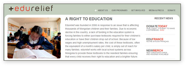
“Edurelief is a development organization focused on breaking the cycle of poverty, improving quality of life, and encouraging hope in the future of people’s lives around the world through sustainable education, training, and advocacy on their behalf.” - Mission Statement
I work with Edurelief as their web consultant and site developer. As a young grass-roots NGO, I have helped them create their branding and identity, bring consistency to their design, and advise in their online presence. The website is running a custom setup of Expression Engine.
