

Monopoly
Monday, October 18, 2010 04:56 PM
A few weeks ago as I was browsing Dribbble I came across this shot (and the following) by Louie Mantia. It’s a pretty cool redesign of the classic Monopoly board game. It takes takes some elements of the original look and streamlines the space. In the comments, Meg Frisch playfully asked who was going to recreate the shot using HTML5. “Hey, that sounds like fun! I should do that.” And so, ladies and gentlemen, here is the HTML5 & CSS3 Monopoly board. Allow me to tell you about this project.
Obviously, since it is using some of the newer tech, IE8 and below are going to have issues (I won’t be able to check IE9 until later this month when my new Windows 7 powered laptop arrives!). Firefox 3.6 and WebKit browsers render it correctly though.
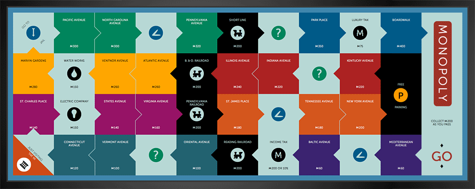
There are a few parts of this that I’m excited about. First, I was able to write, in the source HTML, each tile on the board following the order you would play. Even if something is just for visuals it doesn’t mean you shouldn’t do it right by writing good, semantic markup underneath. So if you turn off the styles in your browser you will see each property listed in order (as an added bonus the word Go at the start and the Go to Jail tile link you to the correct space). Through surprisingly little CSS I was able to flow the tiles visually in the correct order. CSS still amazes me. I was creating websites back when layout and design was hard-coded into your markup. The fact that there is nothing but very basic text with no styles and a full color board with shapes and layout with styles applied is really cool and makes me geek out!
The markup is also very minimalistic. The angle arrows pointing to the next square and the icons on special tiles don’t exist in the markup. They are created with the pseudo element :after. The icons themselves are actually imageless. CSS creates the circles and a custom mini-font embedded with @font-face pulls in the actual icons (A big thank you to John Williams for helping me create the font file so quickly! Also, TypeKit is serving Museo Sans for the main text. TypeKit also pointed me to WebFont Loader which I use on the icons.)
That brings me to something else I wanted to mention. You’ll notice the design is really wide, probably too wide for your screen. Well, the entire thing is em based (which is a big reason I wanted the icons to be font-based) so you can shrink or expand the entire design as needed. Having the entire board flex like this is pretty cool. There are some issues with it though, at least at the moment. Firefox will break the layout every other step or so. The math isn’t precise enough in the ems. This is something I could probably re-visit at some point to really fine tune. WebKit doesn’t break, but it isn’t perfect either.
This was the first time I had the chance to use and learn CSS transforms. I like a project that forces me to learn a new skill. I have been toying with the idea of using transitions to animate the tiles so that when clicked, they would flip over and reveal the property information on the back. We’ll see if I get around to that, it’s a lot of data to type. A friend of mine also suggested I use HTML5’s local storage capabilities to turn this into a completely playable game!
All in all it was a fun little side project. Take a look under the hood if you’re curious about how I did things, the source is right there for you. Enjoy!

Comments
Russell Bishop said
Very minimal markup, I like it! I’m waiting for someone to turn THIS into a playable version using Javascript. Make it happen internet.
On 10/19 at 03:04 PM